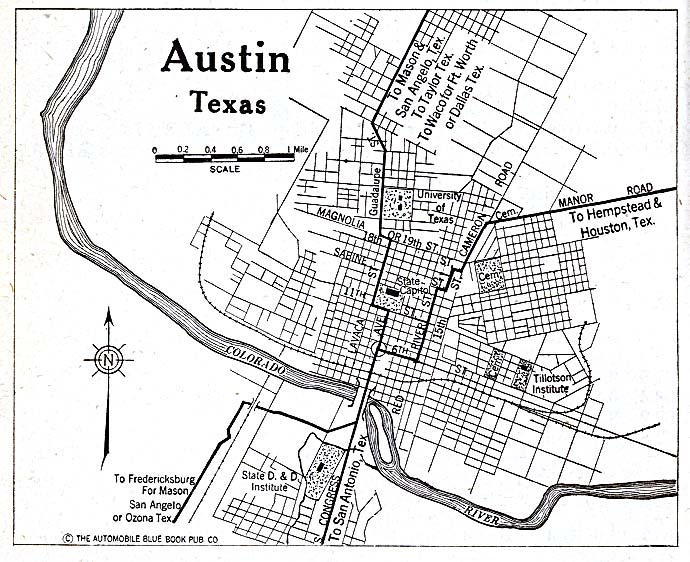
(Preview of our first page: “Austin Development During World War I”)
By Jesse Ritner
In recent years, discussions of Confederate monuments have dominated narratives of public memory in the United States. As important as this discussion is, however, Civil War monuments make up a relatively small percentage of historic markers in American cities. Although less contentious, state and national historic markers polka dot our city-scapes, quite literally inscribing in bronze information about the city’s past on our buildings, street corners, and in our urban parks.
Often these markers seem inconspicuous. Many list the names of long dead citizens, or remark on the importance of architectural styles far beyond the working knowledge of casual perusers. However, these marked places do not exist in a vacuum. Their importance relies on their relationships to other buildings and to the city at large. Yet, that relationship is hidden. The markers speak, when we learn their language, about important aspects of a city’s collective history, even about histories that the marker makers never intended to reveal. Our hope, at Not Even Past, is to make these connections visible through a series of maps which we are calling a digital atlas. In the process we will see what unexpected information might be revealed by the historical markers in our home city of Austin, Texas.
This will by no means be the first digital map of historical markers in the city of Austin. The Texas Historical Commission offers its own map of markers, which naturally include our city. Google Maps has a limited version, along with Stopping Points, and numerous other websites. These maps tend to be thorough, covering relatively reliably the markers they promise, and usually offering addresses, marker titles, and occasionally the marker text (as well as limited and unreliable descriptive metadata). In the case of the Texas Historical Commission they even offer thematic maps (i.e. Women’s History, African American History, Education, etc.).
The Austin Historical Wiki, from the UT departments of Architecture and Historic Preservation, take on important issues in the field of preservation. How do places get preserved, and how can open sourced maps (in this case a Wiki) help to utilize historical markers more effectively? How can we discover what the community wants from their markers, rather than reflecting the desires of a wealthy, motivated, and organized few? (To read their fascinating reflections on the project click here.) Their goals are both admirable and important. Nevertheless, the Austin Historical Wiki, much like these other mapping initiatives, fail (or perhaps more accurately do not attempt) at our goal of providing historical context to often bland and obtuse historical markers scattered throughout the city.
Historians are slowly learning from geographers, anthropologists, architects, and many others how to mine historical information that can be found in landscapes. Geographers and architectural historians are especially good at finding and relaying information on materials, whether it be the type of granite used for the Texas Capitol Building, or the way in which the Balcones Escarpment provides Austin with reliable water during dry seasons. Historians, in contrast, specialize in creating narratives out of historical information. By combining these methodologies of space, data, and narrative voice with technologies such as GIS (Geographical Information Systems), historic markers can reveal a more interesting and comprehensible history of Austin that is already written onto the city.
The goal of our Digital Atlas is a map that can be viewed in layers, allowing connections to be drawn between different markers. This may involve comparing a number of markers that occur in the same year (our first post will be about three markers related to 1917), or it may be something more familiar, in that markers are arranged and colored to allow us to see how women’s lived experience has changed over time. We will release these layers slowly, month by month. Some may include only a few historical markers, while others could utilize ten, twenty, or thirty.
To begin, the maps, while interactive in a limited capacity, will not necessarily help people make connections between markers on their own. However, as layers increase, and more and more markers are entered in our Digital Atlas, we hope to create a map large enough, and with sufficiently searchable metadata, so that the map could be used as a teaching tool in classrooms, as well as a way to discover more about Austin for the curious reader.

The goal of this mapping project is not fully formed. We want to visualize the cityscape, historically contextualize existing markers, challenge existing narratives, and identify events and people who deserve to be commemorated with historical markers, but we expect the project –and our readers—to take us in additional directions.
Building useful digital humanities and public history projects can be difficult and confusing at the start. Despite enthusiasm on the part of departments or faculty, there is little in the way of formal training for graduate students in digital methods and tools. In this project, we are learning by doing, and expect to adapt and change as our needs change and follow the twists and turns it takes us on. What we can promise is transparency in our struggles and our accomplishments, honest reflection on the conflict between our goals and the reality of digital mapping, and the hope that such transparency will help others digital humanists considering such projects.
Read our first edition now: Development During World War I
You Might Also Like:
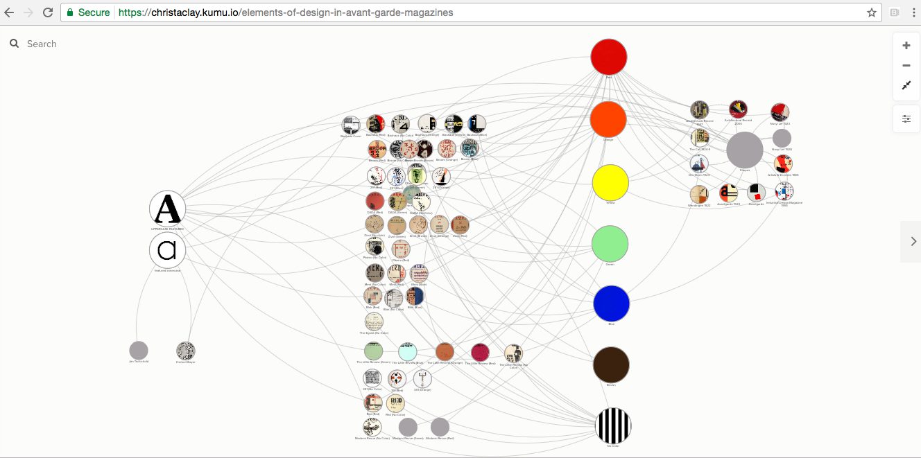
Digital Teaching: Mapping Networks Across Avant-Garde Magazines
Mapping Indigenous Los Angelos: A Public History Project
The views and opinions expressed in this article or video are those of the individual author(s) or presenter(s) and do not necessarily reflect the policy or views of the editors at Not Even Past, the UT Department of History, the University of Texas at Austin, or the UT System Board of Regents. Not Even Past is an online public history magazine rather than a peer-reviewed academic journal. While we make efforts to ensure that factual information in articles was obtained from reliable sources, Not Even Past is not responsible for any errors or omissions.


.jpg)
.jpg)