Over the summer, I spent two weeks in Venice participating in a digital history workshop organized by Duke University and Venice International University. The objective of the workshop was to introduce participants to a variety of digital tools for historical research and presentation. The participants came from disciplines such as art history, history, archeology, architecture history and information science. We learned the basic features of different software, mostly open source, in hands-on sessions.
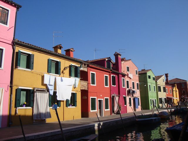
Island of Burano, Venice Lagoon
Once we became familiar with the history of Venice and its geography, we started to work hands-on with various digital programs. We used QGIS to make maps and overlay historical maps on locations in physical space. Another tool that we used was Neatline to create exhibits linking images, maps, and timelines. With SketchUp we produced 3D representations of objects. Lastly, we used Google Earth Pro to record a tour inside a 3D map and produce video files. We also learned the basics of blog and website development, and video editing.
We worked in groups to create a digital-historical narrative of a theme of our own choice related to the topic of the workshop: The Venice Lagoon. I worked with an art historian and an archeologist to produce a narrative about the fortification system of the Venice Lagoon. We produced a video and a timeline exhibition using some of the tools that we learned. You can see them here.
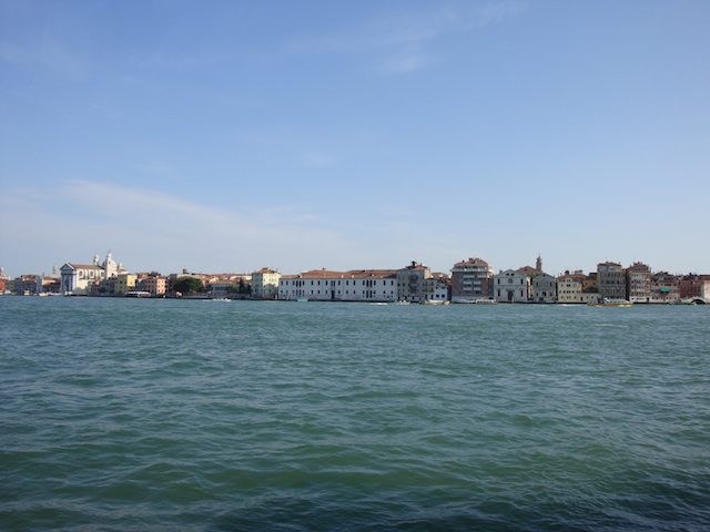
View of Venice From La Guidecca
I would like to recommend two of the tools that we used during the workshop and end with a short reflection about what I believe are pertinent questions to ask when considering going digital.
Geo-Referencing Historical Maps
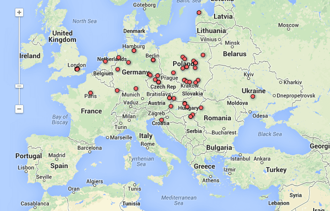
In the first sessions, we learned to overlay historical maps on contemporary maps by geo-referencing them with a free software program called QGIS. Geo-referencing means to assign real world coordinates to old maps. Geo-referencing historical maps can help historians visualize, interpret, retrieve and compare geographic and spatial information. On this webpage of the National Library of Scotland, there are some relevant points to take into consideration about the uses, limits and possibilities of geo-rectifying maps. For example, a possibility is to compare historical maps from cities in different points of time and compare them to present-day satellite images. Also, geo-referencing allows integration of early maps with other topographical information such as height. In some cases one should be cautious of the possible distortions that geo-referencing can cause to historical maps that do not fit contemporary maps with geometrical accuracy. Here you can see a geo-referencing exercise that I made using QGIS with map of the viceroyalty of New Granada—contemporary Colombia, Venezuela, Ecuador, and Panama. I marked six points in the historical map and then matched them with points in the real map. For a step-by-step tutorial for georeferencing using QGIS click here.
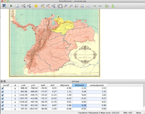
Creating a geo-reference map.

Image of historical map geo-referenced on top of present day map.
A Geotemporal Interface
If you are trying to figure out a way to interactively visualize and narrate historical transformations, a geotemporal interface can be helpful. In the workshop, we learned about geotemporal storytelling using Neatline. Created by the Scholars’ Lab at the University of Virginia, Neatline expands the functionality of Omeka, which is a content management system. Neatline offers the possibility to create a story through an interface that connects a timeline to a map. You can georectify a historical map with QGIS and then place it on top of the default OpenStreet or Google Map to create an exhibition. Then you can start adding objects (events, photos, documents) to link to the map. The interactivity features include a “Neatline-enhanced edition of text documents.” It works by connecting paragraphs, sentences, and words of your own writings with objects in the exhibit. A fascinating example is the project Mapping the Catalogue of Ships which analyzes Homer’s natural geography of Greece through a map of the itineraries of Book Two of the Iliad. The exhibit links the contingents in the Greek army with locations in the map. For more about this feature you can read about Neatline-text here.
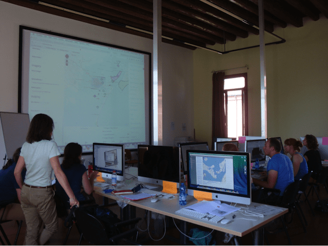
Mac Lab at Venice International University. Venice Visualization Workshop, June 2014.
After my experience in Venice, there are some things that I would recommend for those interested in engaging with digital tools. First, consider how a digital component could enhance your research and teaching.
- Do you want to incorporate digital tools to curate your own archival material and maybe then turn it into an online exhibition?
- Do you want to create public history contents to circulate in social media?
- Do you want to engage digital tools for teaching and as a resource for working in the classroom?
- Do you want to visualize your archival research differently to see if you can come up with new research questions?
- Do you want to use digital tools to visualize a historical transformation that is not easily discernable in the written text?
Secondly, learning new tools always takes time, and archival work and writing consumes most of our time. However, the Venice workshop helped me realize that I can learn to use software that at first might seem too challenging. If you are seriously considering using digital tools for your work, you should be open to experiment and learn the basics about the tools you want to engage with. I would add that ideally, as it has been happening across the world, we should aim for collaborative work among humanists, computer scientists, graphic designers, and digital humanists. For now, there are lots of open source and user-friendly digital tools to experiment with.
![]()
Catch up on the latest from the New Archive series:
Charley Binkow discussed digitalized images from the Folger Shakespeare Library
Charley Binkow explored photographs of California’s Gold Rush
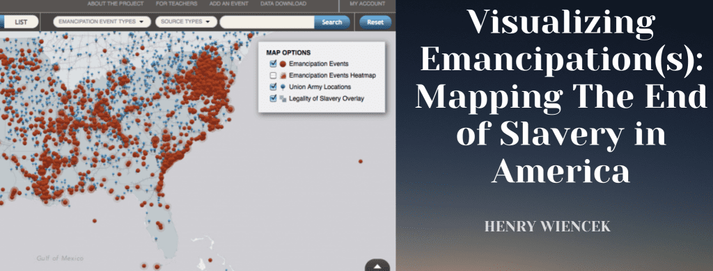
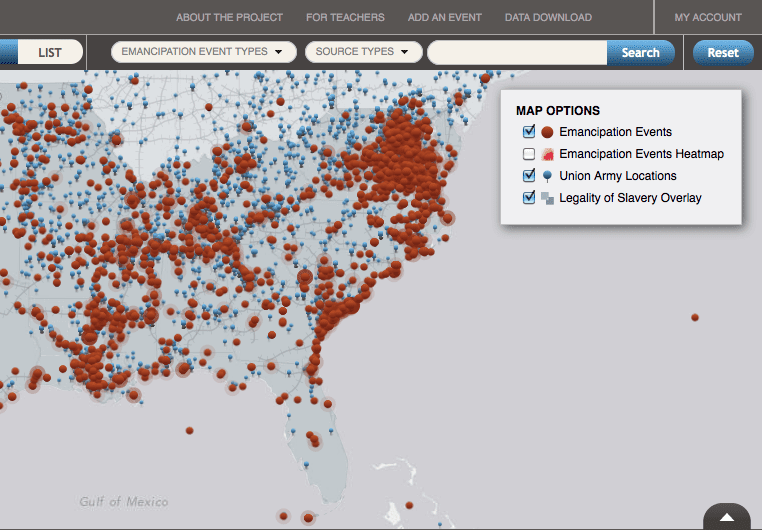
Henry Wiencek found a digital history project that not only preserves the past, but recreates it
![]()
All images courtesy of Maria José Afanador-Llach

