Geographic Information Systems, or GIS, has become increasingly popular with historians because of its ability to visually present information and arguments that would otherwise be difficult to explain in text. However, not all history can be assigned a nine-digit number and placed on a map. “Loosening the Grid: Ideas for Mapping Human Experience,” the keynote address that kicked off this year’s Institute for Historical Studies (IHS) research theme of “Experiencing Place: Interrogating Spatial Dimensions of the Human Past,” questioned the ability of GIS to fully convey the human experience and offered some new ways to include more subjective data in geospatial practices.
Keynote presenters Dr. Anne Kelly Knowles and Levi Westerveld explained how testimonies from Holocaust survivors pushed them to find alternatives to traditional mapping via a method called coordinate geography and how their current work builds on their first experiments. Knowles, currently the McBride Professor of History at the University of Maine and co-founder of the Holocaust Geographies Collaborative, started out using traditional GIS to map historical events like the Battle of Gettysburg (view her TED-Ed talk here). She was eventually persuaded to study how to map experiences that cannot be reduced to straightforward grid coordinates. Together with one of her now-former graduate students, Levi Westerveld, a senior engineer at the Norwegian Coastal Authority, they developed a unique and ground-breaking “geographic language” to map these survivor testimonies.
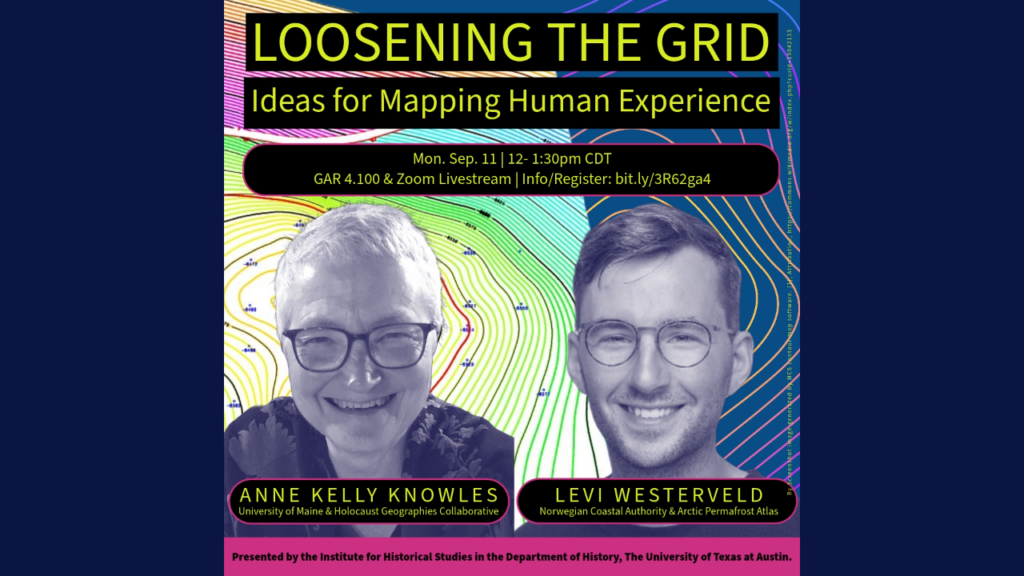
IHS Director Dr. Mark Ravina opened the event by noting that while GIS can tell us a lot about specific locations and events, Knowles and Westerveld’s work is exciting because it “lies beyond conventional GIS” and addresses how “we map human experiences that don’t have geospatial data.” While extremely useful for understanding some parts of our world, Ravina pointed out that Knowles and Westerveld’s intervention comes from the inside – as historical geographers and devotees of the technology. They demonstrate that GIS can be “the wrong tool for massive parts of human experience.”
Teleconferencing from a small town in northern Norway, Westerveld opened the talk with a discussion of traditional cartography and some of the potential limitations that maps have for conveying the lived experiences of people on the ground. He said that while maps are a good way to deliver information, like changes to permafrost levels due to climate change, they often fail to inspire any larger actions because they “fail to connect with our imagination, our feelings, and our ability to put ourselves in the future that these maps are trying to present, and what this means for the human experience for the people living” in these locations.
Weswterveld’s presentation included some examples of his work on the human migration currently happening in the Mediterranean. He emphasized how changing the perspective and presentation of the information on maps can better tell the story of what is occurring on the ground and possibly reach the more emotional side of the viewer. Comparing one of his maps alongside a photograph from a failed immigration attempt, Westerveld said that he wants maps to inspire similar emotional connections as a way to foster broader social, political, or cultural change in the same way a photograph can: “I think there is room for creativity and innovation in the language of cartography for us to bring [the] geographical representation of space closer and more inclusive to the human experiences, not only for communication but also for analysis.”
courtesy of Anne Kelly Knowles and Levi Westerveld
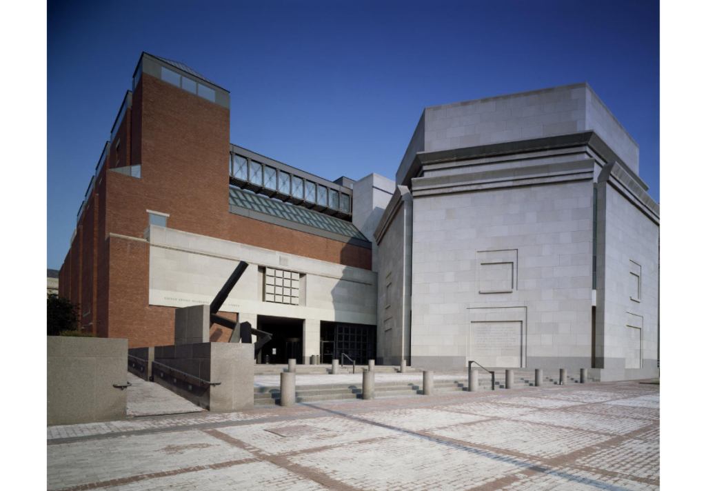
Knowles acknowledged that she started the project without a background in Holocaust studies, history, or geography. However, being a leader in Historical GIS, she was contacted by the Holocaust Museum in Washington D.C. and was asked whether she thought “that GIS might be useful for studying the Holocaust?” She worked with the Museum, as well as other GIS and Holocaust experts, as they pored through millions of documents containing various geographic information. The result was a series of interdisciplinary workshops that created various maps focused on different scales – from the continental all the way down to individual bodies – that used geographic information to demonstrate spatial patterns.
The group produced many different and useful maps. Still, some members were frustrated with the inability to find the “people” in these maps – especially when the maps themselves were based on testimonies from survivors. To address these concerns, Knowles and Westerveld started to question how GIS and cartography, more generally, could represent the actual lived experiences of Holocaust survivors. Instead of building yet another database, Westerveld and other student researchers turned to more “old school” methods – physically drawing out timelines based on the testimonies, sometimes with markers and crayons, sometimes on chalkboards, and even once with Styrofoam and string. By going back to basics, the team could identify the type of spatial and temporal evidence that existed in testimonies.
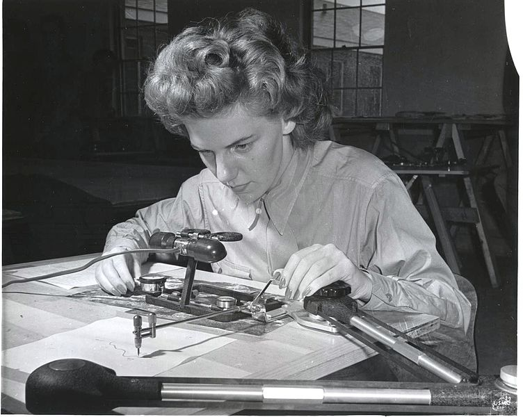
The team realized that many of the most important retellings from survivors centered on small spaces – sometimes even just a single room. They began to pour over the transcripts from interviews with survivors, highlighting all the mentions of space, often finding that important locations were based on places where the survivors could use all of their senses. This meant that locations where survivors spent more time often had more detailed information, even if that space was much smaller than what is traditionally required for mapping.
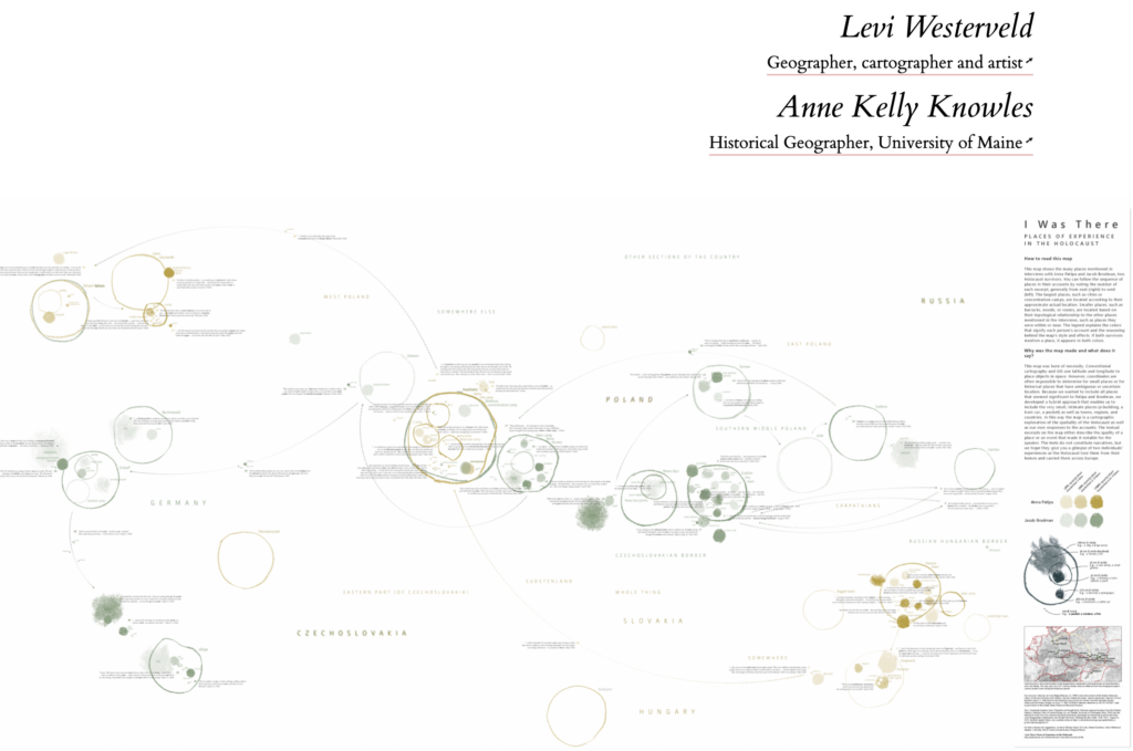
Attempting to balance scale and specificity, the team began to map testimonies in a way that was inclusive of the geographic data they found. They based their maps on mathematical topology. In mathematics, a topological space is a geometrical space, like a circle or square, where closeness can be defined but not necessarily measured with numbers – a great analogy for trying to map testimonies where the locations can be defined in relation to each other but not necessarily given a grid number.
Many of the maps look like what you would see in a biology textbook: circles filled with dots and other circles, some of which had fuzz or darkened clouds drawn on top. However, these circles represented the large but less specific locations in these testimonies, such as a city or large camp. The smaller dots could represent much more specific locations, such as a house or bedroom, and their location in relation to the other circles and dots represents their relative locations between each other and within the testimony. The final maps, then, represent less the geospatially correct locations you might see on a traditional map and focus more on what the survivors experienced, where, and the importance of these places to them.
Knowles expands further on the importance of place between geography and survivor testimonies with her work on another collaborative project entitled Placing the Holocaust. Building on the experience of mapping testimonies with Westerveld, the project incorporates the named places in accounts and includes the important goal of identifying and analyzing “unnamed and non-coordinate places” that the team often saw in the previous project. With the help of machine learning, the testimonies will be coded for both named and unnamed places, “almost none of which, in this unnamed category, have been tagged in other transcript datasets.”
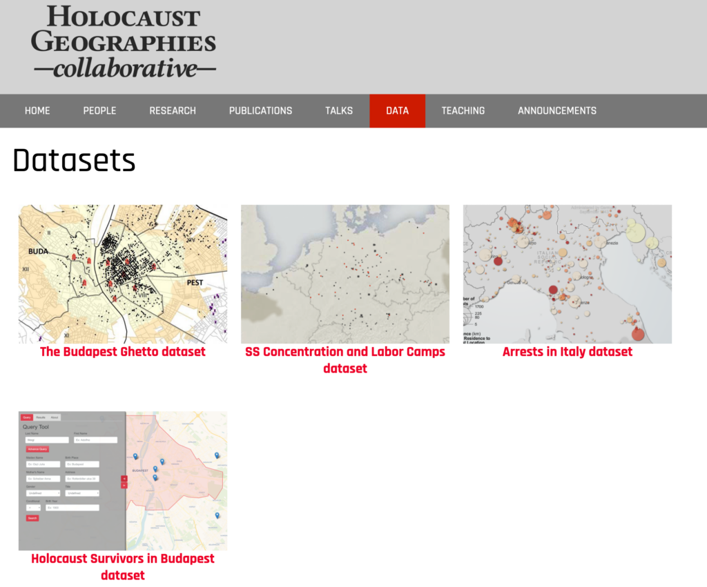
Another aspect of the project looks much more traditional, with dots over a map of Eastern Europe in ArcGIS. Each data point represents a camp or ghetto and includes information about each site from the US Holocaust Memorial Museum’s authoritative encyclopedias. The goal, Knowles says, is for the two data sets to be combined or integrated: “What we want to set up is a dialog between the places of experience and the places as recorded largely in perpetrator data.” For instance, from the traditional map we learn that ghettos were more often surrounded by barbed wire than walls. Students or researchers interested in this aspect could then narrow in on testimonies of survivors and their memories of barbed wire, looking to see where these testimonies came from and their frequency in the record.
While GIS remains useful and important way of visualizing historical information, Knowles and Westerveld make it clear that there are still limitations to its use when it comes to representing the lived experience of the people who often make up those data points. It takes a fresh perspective and multidisciplinary approach to develop innovative methods that better represent how people actually experience spatial information. “Loosening the Grid” is just the start regarding how historians can better use geospatial techniques in their work and their telling of history.
Learn more about the keynote talk and presenters here.
You can also view the full discussion here:
The views and opinions expressed in this article or video are those of the individual author(s) or presenter(s) and do not necessarily reflect the policy or views of the editors at Not Even Past, the UT Department of History, the University of Texas at Austin, or the UT System Board of Regents. Not Even Past is an online public history magazine rather than a peer-reviewed academic journal. While we make efforts to ensure that factual information in articles was obtained from reliable sources, Not Even Past is not responsible for any errors or omissions.
