Can the microbe speak?
It’s 5:30 pm, and I’ve been staring at my computer screen for over eight hours. There’s a crick in my neck, my breathing is shallow, my blood pressure has elevated, and the entire Giza governorate has just disappeared off of the map the instant that I finished tracing its borders—for the third time. I take a deep breath, utter a few choice unpleasant words under my breath, make sure to save my work, and turn off the computer. Today, the dragon has won.
I am two weeks into what I had originally, and naively, thought would be a one-week project to map the outbreak of epidemic and epizootic diseases in Egypt during the First World War, which comprises a subsection of my dissertation project. It’s not a great time to be working on Egypt, as it’s become nearly impossible to get research clearance from the Egyptian government. Funding has also become a near impossibility: my optimism at being named a finalist for a Fulbright in early 2016 was short lived; the program was suspended due to security concerns before awards were announced.
While online resources are scarce, I did find that the Egyptian government’s official gazetteer has an online index of its entire run since the 1870s. Over the course of several days, I discovered that the gazetteer was a virtual treasure trove of exactly the sort of data I’ve been looking for: reports of disease outbreaks in detailed locations up and down the Nile Valley. Over a week, I compiled a spreadsheet of almost 800 records for the period between late 1914 and mid-1919.
The question, of course, was what to do with this data. I was certain the diseases would tell me something, if I could just figure out how to get them to speak.
It was Julia Gossard, a UT alumna now teaching at Utah State University, who pointed me in the direction of the Programming Historian, a website dedicated to helping historians use digital tools to process data through modeling, mapping, and other methods. I didn’t have time to learn a programming language, but mapping was an idea I liked. The site has several columns about creating maps, using open source mapping software. While I’m a big fan of open source, especially when it replaces costly technical software, I was a bit uneasy about the lack of support for the platform – in short, I foresaw the ability to get myself into trouble, but not out of it.
A little digging around led me to the unexpected find that UT has an institutional subscription to ARCGIS, which is the (otherwise very expensive) industry standard mapping platform. Using UT’s institutional subscription to Lynda.com, I started training myself to use ARCGIS.
Had I known what I was getting myself into, I probably wouldn’t have dived right in.
Mapping the data required me to tag each record with the latitude and longitude of the reported location. This led me to one of the key stumbling blocks for all scholars of the Middle East who’ve dabbled in the digital humanities—so much data is out there on the web, but much of it is transliterated from the original language. There is no universally recognized Arabic-to-Latin transliteration method, and the potential inconsistencies are well on display in the web’s largest open-source geographic database, Geonames.org. While some of its Egyptian entries contained the original names in Arabic script, most did not, leaving me to guess—frequently incorrectly—how they might have been rendered. Since Geonames is open-source, I added the names both in Arabic and one of the more commonly recognized transliteration systems to Geonames’s database as I went, which will hopefully make someone else’s life a little easier.
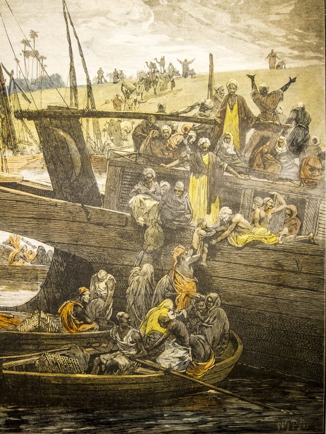
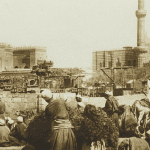
People fleeing a cholera outbreak at the port of Boulaq (near Cairo) in 1883 (via Wellcome Collection)
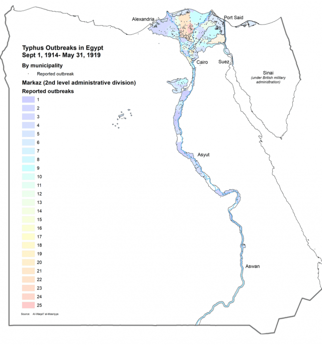
Finally, it was time to start mapping, and herein lay another challenge. ARCGIS has an expansive built in library of open source data, which included, as I had hoped, administrative maps of Egypt. I very quickly realized, however, that the administrative borders of the early 21c did not correlate directly to those of the early 20c. At least one governorate has since been split into three and there were a lot of unfamiliar names on the maps. I discovered that the UT Libraries has a copy of the 1917 Egyptian census, which has a big fold out map of the country. I scanned it, brought it home and compared it to the current maps … and realized that it was probably going to be easier to draw the 1917 map in ARCGIS rather than try to adapt the contemporary maps.
The process took nearly two weeks, employing long forgotten Photoshop skills (yay for bezel curves!), tracing a century old map and rendering it onto a satellite image of contemporary Egypt. The resultant map is, as they say, “good enough.” It’s probably got a distortion of around 2 miles, but it’ll never appear in print at that level of detail. Maybe when my monograph becomes a best-seller, I’ll hire someone to re-draw it.
I learned that ARCGIS has some quirks. It has a tendency to freeze up every 60-90 seconds. I quickly learned to save my work every time I did anything, a lesson that came in handy when, for some reason, the entire Giza governorate vanished inexplicably … three times … after I drew it. (The following morning, I discovered that the governorate hadn’t vanished, it was just invisible. I still don’t actually know why).
Finally, the big day came. After the blood, sweat, tears, swearing, and yelling at the cat, the map was finished. I overlay my disease data, and sat back to look at the results.
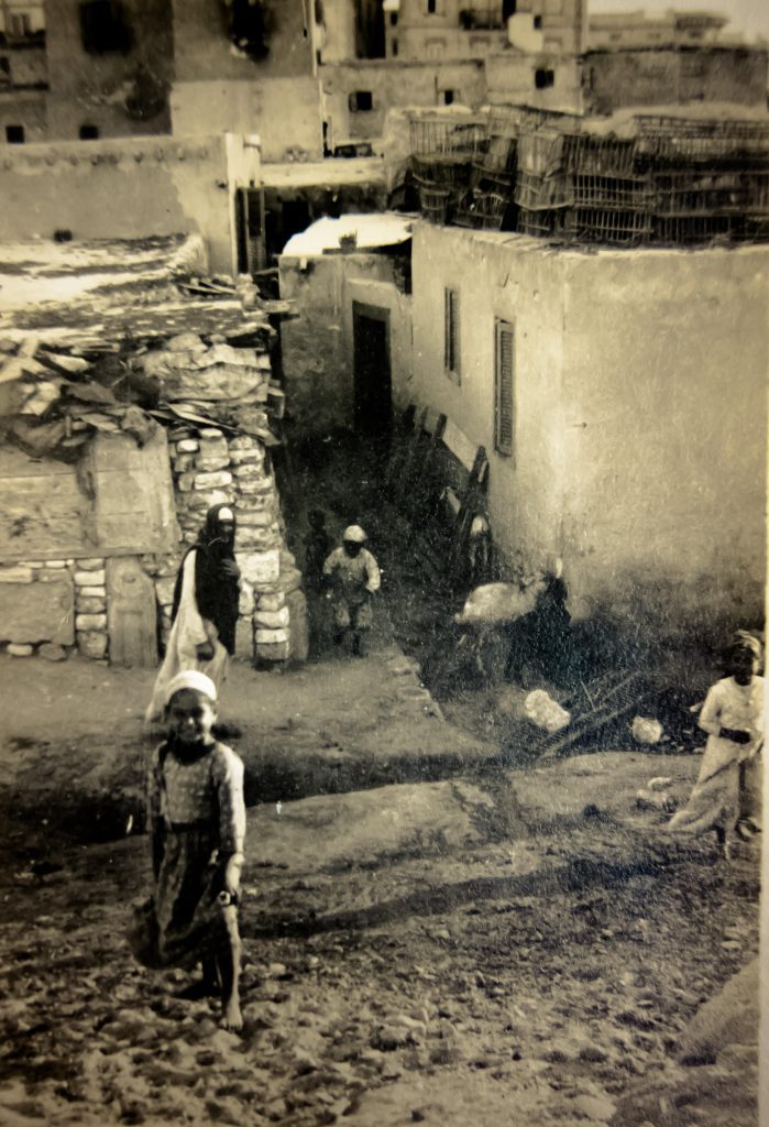
Children playing in a poor neighborhood of Alexandria under quarantine during an outbreak of typhus, sometime around WWI (via Wellcome Collection)
Have the microbes told me a story? They have. As I set forth on the next phase of my project, I have clusters of locations and specific dates to look for. But the maps have also given me more questions—Is there a correlation between a two-year outbreak of cattle plague and the rampant inflation in the cost of food during the war? Does the death of 139,000 Egyptians due to influenza at war’s end have anything to do with the eruption of a populist uprising just six weeks later? And why is this most deadly epidemic absent from the press and the pages of the official gazetteer?
I also realized the importance of presenting my data in this visual form. No one is going to go through all 800 records on my spreadsheet, but the map provides a clear snapshot of my subject and the questions it raises, and it makes a visual case for the argument I’m laying out in my dissertation. In this form, it will make my modest contribution to this field of study more convincing and accessible.
The New Archive series highlights various uses of digital tools in humanities research. More from the series:
Charlie S. Binkow explores Honest Abe’s Archive
Joseph Parrott highlights the digitalized political posters collected by archivist and artist Lincoln Cushing
Maria José Afanador-Llach discusses her experience at a Digitilization Workshop in Venice
Daniel J. Cohen and Roy Rosenzweig, Digital History: A Guide to Gathering, Preserving, and Presenting the Past on the Web
You may also like:
Hanan Hammad on gender in a small town in Egypt
Martin Thomas and Richard Toye discuss the Dreyfus Affair and the Fashoda Crisis of 1898
Cali Slair on the eradication of smallpox
