Roughly 12 million Africans were forcibly transported to Europe, Asia, the Caribbean, and the Americas. It’s hard to conceptualize so many men and women being uprooted from their homes. But Emory University’s Trans-Atlantic Slave Trade Database helps users understand the vast proportions of this perverse exodus. The site pieces together historical data from 35,000 slave voyages between 1500 and 1900 and arranges them onto graphs and maps, offering readers a geographic, demographic, and even environmental context for the slave trade.
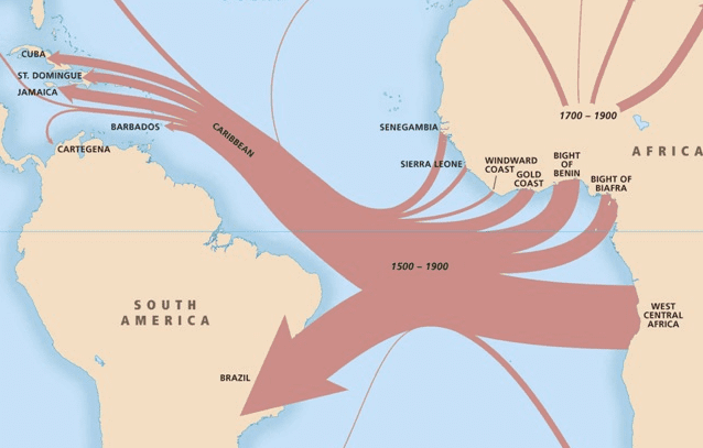
While people may assume that one singular “slave trade” took place, the database maps demonstrate that many existed. And not just across the Atlantic, but around the globe. Overview of the slave trade out of Africa, 1500-1900 charts the routes slave traders followed from Africa to various international ports. But you might be surprised at some of their destinations—traders ventured from East Africa to Arabia, Yemen, the Persian Gulf, and even various ports in India. Although the largest number of slaving ships do land in Brazil or the Caribbean, this map demonstrates that Africa’s slave trade was very much feeding a world market. The variety of international ports participating in the trade is also striking. This was not a black market undertaken by a depraved few, but rather a thriving worldwide industry that brought ships, employment and wealth to numerous communities on both sides of the Atlantic. The maps make this point visually with striking impact.
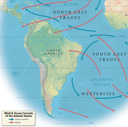
The site also reminds readers that the process of moving enslaved Africans across the ocean was as much an environmental process as an economic one. The map, Wind and ocean currents of the Atlantic basins reveals how oceanic forces played a role in determining the travel routes for slave ships. Red and blue lines respectively denote winds and currents swirling between Africa and the Americas, facilitating particular geographic courses better suited for crossing the ocean. These natural forces effectively created two separate “slave-trading systems,” as the site identifies them: one originating in Europe and North America and the other originating in Brazil. Historians have certainly detailed the racism and greed motivating the slave trade, but comparatively little time examining the environmental processes that made it possible. Particular centers of trade emerged along the coasts of Brazil, the Caribbean and West Africa to meet an economic need, but also to harness the currents and winds essential to moving so many men and women such vast distances. And here too, the visual character of the map makes it easy to see how natural forces worked to shape the historical events.

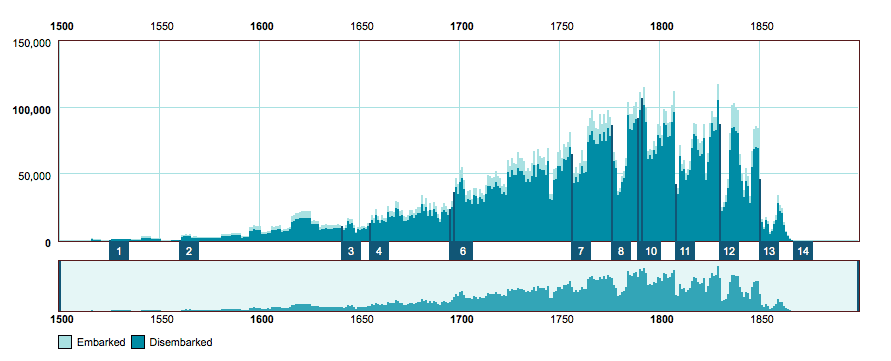
Numerical timeline graphing the number of African captives in the trans-Atlantic slave trade between 1500 to 1866 (Emory University)
In addition to these visual aids, the site also includes a more quantitative rendering of this nefarious business. A timeline graphs the number of captives who embarked and disembarked between 1500 and 1867. Users can make the information even more precise by expanding or contracting the time frame or manipulating different variables, including sites of disembarkation, embarkation, and nationality of the slave ship. This visual tool reveals a steadily growing trade, with the number of embarked Africans peaking at around 115,000 in 1792. You will also find a chilling disparity between the number of “Embarked” and “Disembarked” Africans in the statistics—a powerful indication of the deadly voyages these individuals were forced to endure.
The sheer numbers documented in the Trans-Atlantic Slave Trade Database are astonishing. With much of the globe participating, an elaborate network of ports, ships and trade routes uprooted millions of African souls with ruthless efficiency. Some users might find the site’s emphasis on graphs and maps to be sanitizing or dehumanizing to the enslaved individuals—too many numbers and figures, not enough people. But the story this site wants to tell is a big and highly important one. The African slave trade had a global reach; it was an environmental force as well as an economic one; and it displaced millions upon millions of men and women from their homes. Visualizing the statistics makes the global reach of their human toll palpable in new ways.


