• Features
  • Books
  • Teaching
  • Digital & Film
  • Blog
  • IHS
  • Texas
  • Spotlight
  • About

The past is never dead. It's not even past

Not Even Past

Teaching with Wikipedia

When Public History is done so well, we want to celebrate it! In Fall 2018, our colleague in Art History, Dr. Stephennie Mulder,  had her students rewrite articles on Wikipedia to be more accurate and based on up-to-date scholarship. To be honest, I’ve thought about doing something like this in my classes, but I would never have done such a creative and thorough job. Now the instructors among us have a model and a roadmap we can all use. And the rest of us can sit back and watch some great teaching unfold because Dr. Mulder recently recounted the process on Twitter. Enjoy! ~ Joan Neuberger
by Dr. Stephennie Mulder

 Read on Twitter

      This semester in my Arts of Islam survey, I decided to scrap the research paper and have students collaborate to re-write @Wikipedia articles. It ended up better than I could have imagined & transformed how I think about teaching #StudentsOfIslamicArt #IslamicArt #MedievalTwitter

      I was hesitant about shaking up a popular class that had worked well for years, but one statistic finally convinced me: 90% of Wikipedia articles are written by men – and largely by men from Euro-American contexts.

Female scholars are marginalised on Wikipedia because it’s written by men | Victoria Leonard 

      The oft-maligned #Wikipedia is the now the world’s most frequently-consulted source of information & fifth-most visited website. Because anyone can be an editor, it’s on us to make it the best resource it can be. If you think Wikipedia is bad, look in the mirror. Wikipedia is us.
      So this assignment quickly took on a much deeper significance than a research paper. It required them to develop many of the same research and writing skills as a research paper, but it also came to have a strong #civics and #SocialJustice component, and the students responded.
     To emphasize the collaborative, real-world applicability of the assignment, I set it up as a partnership with a museum and another Islamic art class via my brilliant
colleagues  @lk_michelsen @hi_shangrila and @AlexDikaSegg @Rutgers_Newarkshangrilahawaii.org
      The assignment asks them to imagine they’re hired as consultants for a major museum to improve the public’s knowledge on Islamic Art, in advance of an exhibition. Their task? To assess an article for the quality of its sources and content and then research, write, and improve it.
      I have almost 50 students enrolled in the class, so I made the assignment collaborative and divided the class into 15 groups of 3-4 students. I then preselected #IslamicArt articles I knew were important but underdeveloped on #Wikipedia. They had 3 weeks to research & 3 to write.
      The assignment was set up on @WikiEducation‘s terrific website. Students had to complete a training module/week. Through this and discussion in class they learned how to determine quality of sources, the value of peer review, and improved research methods.


Wiki Education — Connecting Higher Ed and Wikipedia

      In addition to the online training modules, @WikiEducation mailed me hard-copy pamphlets to give the students: one general one on Editing Wikipedia and another new one on editing Art History topics. These were super helpful.

New Resource Helps Art History Students Improve Wikipedia

      I also drew on @artandfeminism‘s amazing quick guides which are brilliant for edit-a-thons.
      But on top of these crucial online resources, I wanted to highlight continuing value of analog sources so students could gain experiential knowledge of benefits of both types of sources. I pulled in our brilliant #librarians Becca Pad and Gina Bastone from the UT Fine Arts Library @UTFAL and UT Libraries @utlibraries 
      Becca and I created a research guide for the assignment that pointed students to both digital and hard-copy sources within @UTFAL and @utlibraries.
      I also spent a day in the library with students, walking them through basic research methods. I thought this might be too basic, but the day walking them through the physical library was inspired by a comment made by one of our brightest Honors Art History undergraduates in a meeting of the UT Provost’s Libraries Task force (on which I currently serve):
    “Many faculty and librarians don’t realize that it’s not that undergraduates don’t *want* to use the libraries, it’s that we are SCARED of the libraries.” She explained that many students no longer receive the basic training needed to know how to use the libraries. So they don’t.
View image on Twitter

Here’s Eleanor Garstein’s and Dea Sula’s revamp of the Pyxis of Zamora

      The UT Library system is one of the United States’ great research collections, but the vast majority of undergraduates test out of basic Intro to Rhetoric and Writing-type classes that used to train them in basic research methods. So the libraries just look intimidating and baffling.
      Just getting them physically in the library was revelatory. They were astonished at the range and quality of sources that did not turn up on a Google search. It really lit a fire under them, sparked their curiosity and made them want to dive in. This was revelatory for me too!
      We talked about what a privilege it is to have access to depth and reliable quality of knowledge in a top research library. We talked about how access to knowledge controls the way we see the world and our place in it. Again and again, students spoke about feeling empowered.
View image on Twitter

Zain Tejani and Tarik Islam improving the article on Islamic Gardens by replacing some of the more subjective aspects of the pages on the Islamic gardens with entries on the surviving gardens and sensorial experience. They later found their edits reverted by another editor – a valuable lesson about how to work within Wikipedia’s editor community (they’re still in negotiations on the Talk page!)

      Yesterday [December 12, 2018] we met for an upload party. I wasn’t sure how it would go, but it turned out to be one of my favorite days as a teacher EVER. I am so proud of my students and of their hard work. I am amazed at how seriously they took the assignment and what a terrific job they did.
      There were challenges: the sometimes-difficult collaborative aspect of a group assignment, the fact that some topics had few sources, the challenge of learning to write in a neutral, unbiased style. But they had something real on the line: an article out there in the world.
      And in the end, these smart students have now contributed 15 better-sourced, better-written articles to the most frequently-consulted body of knowledge in the world. And they’ve learned key research and writing skills that will be applicable in a range of fields.
      And of course, they’ve deepened their knowledge of #IslamicArt. Just listen to my student Gabrielle Walker speaking confidently about the complex history and historiography of Raqqa Ware, a type of medieval Islamic fineware pottery.
      There is room for improving even important and significant topics on Wikipedia. Carla Bay, Sukaina Aziz (@SukainaAziz), and Yasmeen Amro (@TheYasmeenAmro),  made major improvements to the article on Muqarnas, perhaps the most distinctive form of Islamic architectural ornament:

Embedded video

      In short, this assignment did all a traditional research paper does: deepening knowledge, research, and writing skills – but it also left them feeling empowered to be active contributors: shaping global knowledge and redressing imbalances that shape the way we see the world.
      So if you’ve ever wanted to have students do a Wikipedia article writing project, I would encourage you to jump in and follow Wikipedia’s motto: #BeBold. Your students will learn, and you will all feel like you made the world just a tiny bit better place to be.
      And super grateful to the fabulous @LaurenMacknight, our hardworking and incredibly on-it communications director @UT_AAH, for enthusiastically promoting our project on multiple platforms! You’re incredible. 🙂
More from @stephenniem on Twitter
Stephennie Mulder@stephenniem

And on Not Even Past, a feature on Dr. Mulder’s award-winning book: Carved in Stone: What Architecture Can Tell Us about the Sectarian History of Islam

Digital Teaching: Mapping Networks Across Avant-Garde Magazines

By Meghan Forbes

In “The European Avant-Garde in Print” (REE 325), students explored the unique and vibrant print culture in Central Europe between the two world wars and the social and political context that produced it. I sought to expose students to the networked qualities of magazines that were published in Czech, Hungarian, Serbo-Croatian, Polish, and German. We examined contributor lists, the aesthetic qualities of the “New Typography,” and the way that the magazines cross promoted each other through advertisement.

Students discovered the transnational and multilingual interconnectivity of these magazines through the use of various digital mapping and open source publishing resources, such as Kumu and Scalar. Using Kumu’s Social Network Analysis tool, for instance, I could help students visualize how one figure, such as Karel Teige, the leading member of the leftist Czech avant-garde group Devětsil, leveraged his connections with editors elsewhere to make magazines that facilitated relations with major figures of a pan-European avant-garde. To offer just one example, through the Brno-based magazine, Pásmo, the Czech avant-garde actively collaborated with the Russian born and Berlin-based artist El Lissitzky, the German Bauhaus director Walter Gropius, and French-German correspondent Yvan Goll.

(via author)

I used digital mapping in my lectures  to make this fluid exchange more concrete and dynamic for students.  Then, a major component of the class was built around students developing their own digital mapping and visualization group projects. In this way, students had the opportunity to engage critically and interactively with the materials covered in the course.

One group drew on our extensive discussion of Dada periodicals published both in Europe and the United States—which we had the opportunity to view in person at the Harry Ransom Center—to reveal how some prominent artists appeared in Dada publications on both sides of the Atlantic. They also used their map to comment on who did not figure in these publications—namely, women, with the exception of the New York-based 291 contributor Agnes Meyer, whom they featured.

(via author)

Another group of students chose to document connections across a series of publications not via their contributors or geographic locale, but rather in relation to shared principles of design, such as color, shape, and textual form. This group even built their map to visually reflect in its own design the various components that they chose to highlight.

(via author)

Another project focused on a single magazine—the Italian Poesia—to make manifest the various personal connections between the leading figure of Italian Futurism, F.T. Marinetti, and other artists and authors related to the movement.

(via author)

The digital mapping component of the course was largely made possible with the assistance of UT’s Slavic and Digital Scholarship librarian, Ian Goodale, who made multiple class visits in which students had the opportunity to workshop their digital projects, and who also held weekly office hours in the Slavic Department. Ian also created a Scalar platform that holds all the mapping projects in one place, with the Kumu maps embedded, and includes other analytical content generated by students, allowing for further connections to be drawn across the group projects.

I observe in my own classroom, and in the work of my peers both across UT and at other institutions, the need for universities and colleges to commit to allocating funding for their libraries so that they may train and hire staff who are able to support digital pedagogy. For example, this past semester, Ian Goodale also helped my colleague in the Slavic Department, Vlad Beronja, create another digital project, Yugoslav Punk, with students in his course on Punks & Divas in Southeastern Europe.

Another aim in teaching “The European Avant-Garde in Print,” was to expose students to non-European periodicals, to explore the variety  of responses to inter-war social and political conditions, and also to find actors outside of a European male cohort largely not represented in the Central European set. By giving students the opportunity to create their own mapping projects, I hoped to reveal unexpected connections between these cultural products. There is more work to be done in achieving these goals in a future iteration of this course, and data visualization and digital mapping tools will facilitate students’ active learning towards this end.

You may also like:

Digital Learning: Starting from Scratch, by Joan Neuberger
Media and Politics From the Prague Spring Archive, by Ian Goodale
The Prague Spring Archive Project, by Mary Neuburger and Ian Goodale

Tatlin’s Fish: Art and Revolution in Everyday Life

By Peter Worger

Tucked into the pages of Nikolai Punin’s diary is a sliver of silver paper made into the shape of a fish. Its scales have been drawn with what appears to be black marker or charcoal in an Impressionist style on one side and in a Cubist style on the other. The fish has two fins along its underside and a pointed tail, most of which have brightly-colored orange tips, and there is a razor-like saw of a fin on its backside. An orange piece of yarn is tied to its mouth as if the fish had been caught with it, making it easy to hang or pull out of a book. The whole object is about the length of a page and, since it was found in a book, one can assume it was made to be used as a bookmark.

unspecified

unspecified-1

Both sides of the fish are decorated in silver and orange (Punin papers, Harry Ransom Center).

The fish was a gift from the famous Soviet avant-garde artist, Vladimir Tatlin, to his friend, the art historian Nikolai Punin. The two men worked together at The Museum of Painterly Culture in Petrograd in the early 1920s just after the Russian Revolution when the diary was written. Punin worked in the Department of General Ideology and Tatlin was producing an experimental play by the poet Velimer Khlebnikov, another friend and collaborator in the circle of Russian revolutionary, avant-garde artists. For Punin, Tatlin represented a particular quality of Russian art that made it surpass the latest Cubist innovations in painting coming from France. In 1921, Punin had already written a polemic entitled, “Tatlin (Against Cubism).” In this short work, he argued that Tatlin made the same innovations in art as the French Cubists, but surpassed them because the tradition of icon painting in Russia gave the Russian avant-garde a particular appreciation of the paint surface. The lack of a Renaissance tradition of perspectivalism, according to Punin, also gave the Russian avant-garde a much freer relationship to space. Punin referred to The Fishmonger, as one of three paintings that represented Tatlin’s start in this direction. In that painting we can see multiple fish that have the silver and orange coloring as the paper fish found in Punin’s diary. Tatlin’s early experiences with church art, painting icons, and copying wall frescoes, was crucial in the development of his style as well as his ideas about the role of art in revolutionary society. The icon was both a work of art and an object for everyday use. This emphasis on the image as everyday object became important in expanding Tatlin’s creative pursuits to include the construction of utilitarian objects to transform the nature of everyday life in the USSR during the transition to socialism.

the-fishmonger-1911-jpglarge

The Fishmonger, by Vladimir Tatlin, 1911 (via Wikiart).

In 1923, Tatlin became the Director of the Section for Material Culture at the Museum of Painterly Culture. During his tenure there, he authored several documents outlining his general program for the role of material culture in the USSR. In an article written under his direction called “The New Way of Life,” he described a series of new projects and prototypes, namely a new design for a coat, and one of five new designs for an oven that could cook and keep food warm for 28 to 30 hours and also keep the home heated economically. Tatlin incorporated the text of “The New Way of Life” into a controversial work of the same name, a photo-montage showing images of the designs that were meant to depict that revolutionary new way of life. He created it for display in the showroom of the Section for Material Culture and the designs were also shown at the Exhibition of Petrograd Artists of All Tendencies. Punin wrote a favorable review of Tatlin’s work in the exhibition, but other critics who believed that art should occupy a place “beyond the realm of the everyday” found the designs inappropriate. Tatlin’s work was revolutionary in that it challenged this traditional boundary between art and the everyday.

unnamed

A New Way of Life, by Vladimir Tatlin (via Russian State Archive of Literature and Art).

The fish is an important indication of a close personal and professional relationship between the artist, Vladimir Tatlin, and his admiring critic, Nikolai Punin, and it represents the ways that Tatlin and Punin tried to outline a new revolutionary program for art. It also is an example of that very revolutionary impulse in that it is an object to be contemplated for its aesthetic beauty and also to be used for a utilitarian purpose as a bookmark. Tatlin’s work paved the way for a new interpretation of art as something that could be figurative as well as useful; art in revolutionary society could have a place in the daily lives of every individual and not only in the lofty realm of the art establishment. This little fish offers a window onto the theories of the period of the Russian Revolution, when people sought to rethink the entire Western European model of not only aesthetics but also society.
bugburnt

Tatlin’s fish can be found in The Punin Collection, Harry Ransom Humanities Research Center, The University of Texas at Austin.
Additional Sources:
Anonymous, “New Way of Life,” in Tatlin, ed. Larissa Alekseevna Zhadova (1988).
John E. Bowlt, review of O Tatline, by Nikolai Punin, I. N. Punina, V. I. Rakitin, Slavic Review 55, no. 3 (1996).
Christina Kiaer, “Looking at Tatlin’s Stove,” in Picturing Russia: Explorations in Visual Culture, Valerie A. Kivelson and Joan Neuberger, eds (2008).
Jennifer Greene Krupala, review of O Tatline by N. Punin, I. N. Punina, V. I. Rakitin, The Slavic and East European Journal 40, no. 3 (1996).
John Milner, Vladimir Tatlin and the Russian Avant-Garde (1983).
Nikolai Punin, “Tatlin (Against Cubism),” in Tatlin, ed. Larissa Alekseevna Zhadova (1988).

bugburnt
You may also like:

Rebecca Johnston studies a letter pleading for Nikolai Punin’s release from prison in Policing Art in Early Soviet Russia.
Andrew Straw looks at the evolution of Soviet communism in Debating Bolshevism.
Michel Lee discusses the relationship between Leninism and cultural repression in Louis Althusser on Interpellation, and the Ideological State Apparatus.
bugburnt


The Countess’s Cats

by Douglas Cushing

Francesca Consagra, curator of In the Company of Cats and Dogs at the Blanton Museum of Art, has observed that felines and canines in art are rarely mere props. More than decoration, their presence serves a meaningful purpose. These creatures may represent human endeavors, moralities, values, and behaviors. Alternately, their image may signify the lives and conditions of individual animals themselves, or entire categories of such animals, existing in domestic relationships with humans, as suppliers of labor, or even as a sources of food. Animals in art offer novel and useful ways to understand historical trends and events. Within this exhibition, an excellent example of how cats provide charged and multifaceted meanings in a work of art, is a hand-colored, soft-ground etching by James Gillray entitled The Injured Count, S. __ (c. 1786).

Countess

James Gillray, The Injured Count S. ____, (c. 1786). Hand-colored soft-ground etching. Blanton Museum of Art (used with permission).

The print depicts the buxom Countess of Strathmore, Mary Eleanor Bowes, blithely suckling two greedy cats as she drinks wine or liquor with a pockmarked companion. A child at her side bawls, “I wish I was a cat / my mama would love me then.” Despite its curious scenario, the print reflects the tendency towards pet keeping that emerged in Enlightenment England. It also points to the Western historical-symbolic relationship between femininity and felinity, the status of women in late eighteenth-century England, and the machinations of power that played out in arenas of class and gender.

Gillray was a satirist working in a field that frequently burlesqued Georgian women, especially prominent ones.. The last four decades of the eighteenth century, when he was at work, are frequently thought to be the high point of English satirical printmaking. Here, the artist—something of a hired gun in the day—was likely fulfilling a commission that joined a series of attacks leveled against the countess. At the far left margin of the print, Gillray depicts her forsaken husband, Andrew Robinson Stoney, surveying a map of the countess’s estate. Stoney later changed his surname to Bowes, fulfilling the wishes of his wife’s father as expressed in his will. This name change traded the military associations with his family name for the more politically and socially recognized Bowes name, ultimately helping him to gain a position as M.P. for Newcastle. Stoney, however, was actually a fortune seeker, who, coveting the Countess’s wealth and social advantage, had tricked her into marriage. Widowed by John Lyon, the Earl of Strathmore, the lady’s dowager status gave her the right to own property—something denied to married women. This included the sizable inheritance she had brought into the marriage, which attracted Stoney. Staging a duel against a libelous newspaper editor in defense of the countess’s honor, Stoney emerged wounded. Under the pretense of a dying wish, he asked the countess’s hand in marriage.  She agreed, and once married, Stoney recovered miraculously.Unbeknownst to him, however, her fortune had been deeded into the care of trustees. Stoney soon began to abuse his new wife physically and mentally. In time, the countess sought a divorce. She won preliminarily in an ecclesiastical court, but Stoney conspired to kidnap her and keep her hidden. Stoney also employed mendacious newspaper stories and satirical prints in an attempt to sway public opinion against the countess. When she eventually escaped and continued proceedings, the utter reprehensibility of Stoney’s actions secured a divorce.

The cats in this print likely represent the countess’s actual pets, Angelica and Jacintha. Tellingly, Stoney had lamented in a courtship letter that he was not one of her cats, musing, “. . . were I Proteus, I would instantly transform myself, to be happy that I was stroked and caressed like them, by you.” Gillray twisted Stoney’s sentiment in order to depict Mary Ellen Bowes as a bad mother who preferred her cats to her children. In truth, both Stoney and her previous husband’s family had cruelly separated her children from her at length. In addition to the accusation of being a poor mother, the presence of the licentious footman, beckoning her to bed, suggests that she is an adulterous wife. Infidelity was one of the reasons argued for divorce in eighteenth-century England, though marriage was generally held to be inviolable. The best that most people wishing a divorce could expect from the ecclesiastical courts of the day was a legal separation allowing a couple to live independent lives without dissolving the marriage itself. Full annulments were rarely granted to men, and almost never to women. Occasionally, after the ecclesiastical courts refused to dissolve certain marriages, special dispensations from Parliament (in the form of acts) permitted individual-case divorces. Such legislation was usually aimed at safeguarding fortunes from “bad” women and illegitimate children.

Cushing Bowes doc

The lives of Andrew Robinson Bowes, Esq. and the Countess of Strathmore, written from thirty-three years professional attendance, from letters, and other well authenticated documents. By Jesse Foot Published 1810 for Becket and Porter, and Sherwood, Neely, and Jones, by J. Bryan in London. Available from Open Library

As symbols, cats reiterate these social constructions of femininity that is motherly if it is good, and morally negligent—wanton, desiring, willful, chaotic, and vicious—if it is ill. Cats often connoted immoral femininity, following a tradition that emerged from the concatenation of felines, Satan, and witchcraft from at least by the early thirteenth century until the Enlightenment in the eighteenth century. Above the countess in the print, Gillray places a painting of Messalina, one of antiquity’s most scandalous women, so as to reinforce the negative characterization of the countess. .

Gillray’s anthropomorphized cats also stand for what they are—pets. By the eighteenth century, the former luxury of keeping pets was practiced at all levels of society. And by the middle of the following century, cats would easily eclipse dogs as favorite pets in London. In this regard, the countess’s cats reflect the real tendencies of keeping pets and the growing popularity of felines in Georgian England.

Yet, in Gillray’s Injured Count, S., both woman and cat represent ideas of illicit femininity. A woman’s proper role in the day, enforced by a male-governed society, was foremost as a wife and mother, and in the late eighteenth century, breastfeeding was a sign of a good mother. Gillray’s 1796 The Fashionable Mamma,—or—the Convenience of Modern Dress lampoons an aristocratic woman, who, dressed in a skimpy, high-fashion gown, dispassionately suckles her child while her coach, visible through a window, waits to shuttle her away. A painting above her head entitled “Maternal Love” offers a foil, depicting a peasant woman who lovingly nurses her child in a natural landscape. The distinction between the dispassionate aristocratic mother, authentic natural mother, and the countess unnaturally suckling her cats, speaks volumes.

bugburnt

Listen to Francesca Consagra discuss the exhibit and the roles of cats and dogs in history on a podcast episode of 15 Minute History.

Read more about pets, marriage, and satirical prints in early modern England:

Anna Clark, Scandal: The Sexual Politics of the British Constitution (2004)

Adrian Franklin, Animals and Modern Cultures: A Sociology of Human-Animal Relations in Modernity (1999)

Richard Godfrey, James Gillray: The Art of Caricature (2001)

Draper Hill, The Satirical Etchings of James Gillray (1976)

Linda Hults, The Witch as Muse: Art, Gender, and Power in Early Modern Europe (2005)

Cindy McCreedy, The Satirical Gaze: Prints of Women in Late Eighteenth-Century England (2004)

Wendy Moore, Wedlock (2009)

Oliver Ross McGregor, Divorce in England, A Centenary Study, (1957)

Walter Stephens, Demon Lovers: Witchcraft, Sex, and the Crisis of Belief (2002)

bugburnt

Douglas Cushing earned his BFA at the Rhode Island School of Design and his MA in art history at the University of Texas at Austin. His master’s thesis, written under the supervision of Linda Dalrymple Henderson, examines Marcel Duchamp’s relationship with the writings of the Comte de LautrĂ©amont. Douglas is currently a PhD student in art history at the University of Texas at Austin and the Andrew W. Mellon Fellow in Prints and Drawings, and European Paintings at the Blanton Museum of Art.

bugburnt

Carved in Stone: What Architecture Can Tell Us about the Sectarian History of Islam

by Stephennie Mulder

Syria – birthplace of civilization, home of the first alphabet and the earliest cities, land that bears the spectacular architectural imprint of empires from the ancient Hittites, to Alexander, to Rome, to the Ottomans  – is now a country synonymous with civil war, fanaticism, and unspeakable brutality. The stories coming out of contemporary Syria are horrifying and heartbreaking, and, we’re often told, have their roots, in part, in a primeval sectarian conflict between Islam’s two main sects, the Sunnis and the Shi’is. Sectarian conflict, it is said, has raged for 1,400 years, since the founding of Islam in the 7th century.  This truism is usually accepted uncritically by the media, is common in popular discourse about the Islamic world, and, as we’ve seen in recent months, is also one embraced by violent extremist groups like the Islamic State (IS), who use it to justify heinous acts of cruelty against minority groups. But it’s worth pausing for a moment to imagine how it would look if a similar narrative were applied elsewhere: if today’s tensions between, say, Turkey and Europe were said to stem from an ancient conflict between the Holy Roman Emperor Charlemagne and the Byzantine Empress Irene. Attributing modern sectarian conflict in the Middle East to events that transpired in the 7th century is every bit as nonsensical.

Mulder cover

One reason for the continuity of this narrative of unending conflict is that it’s a tale frequently told in the medieval Arabic texts themselves. In this version, the key moment was the Battle of Karbala in Iraq in AD 680, when Sunnis martyred al-Husayn, the grandson of the Prophet Muhammad and leader of the early group of Shi’i partisans, and took his head and his family members in chains back to Damascus, capital of the triumphant Sunni Umayyad Caliphate.  The Sunnis prevailed and the Shi’is became a persecuted minority, devoted to the Prophet’s family, which they marked by the proliferation of a culture of shrine building and veneration. Another pivotal episode in this text-based narrative occurred between the 11th and 13th centuries. The Arabic sources call this the era of “Sunni Revival,” for it saw the demise of the last Shi’i caliphate and the final entrenchment of Sunnism as the predominant sect in most regions of the Islamic world.

But architectural historians don’t rely only on texts alone, and in this case, the history of architecture in Syria reveals a somewhat different tale. If we let the buildings speak, some vivid contradictions to the familiar narrative arise. For example, we learn that the period of Sunni Revival in Syria was, counterintuitively, the one in which the largest number of “Shi’i” shrines were built, some 40 of which survive into the contemporary period. And, we find that these “Shi’i” shrines were endowed, patronized, and visited by both Sunnis and Shi’is: in many cases, by some of Islam’s most illustrious Sunni rulers. Far from being vanquished during the Sunni Revival, Shi’ism may well have been the dominant sect in northern Syria in the 11th-13th centuries.  Although episodes of conflict are certainly part of the sectarian history of Islam, it would seem there’s another tale too. Looking at architecture reveals an equally important past marked by cooperation and accommodation.

Magnificent 12th century shrine, Mashad al-Husayn, in Aleppo surrounded by modern buildings. The red-roofed structure in the shrine’s courtyard was built to provide shade for today’s pilgrims.

Let’s take as an example a shrine in northern Syria and read it through the eyes of an architectural historian. The building in question is the Mashhad al-Husayn, dedicated to the Prophet’s martyred grandson, who was also one of the Imams, the perfect and infallible religious leaders of the Shi’a. On aesthetic grounds alone, the Mashhad al-Husayn is one of the most spectacular buildings of the 12th-13th centuries, but despite its magnificence, it has rarely been studied. Imagine for a moment that Chartres Cathedral had been largely ignored by architectural historians, and you’ll get a sense of how peculiar this is. The reason probably has something to do with the fact that the standard, conflict-driven narrative had no room for the construction of such a monumental “Shi’i” building during the era of Sunni revival.

Interior, Mashhad al-Husayn

Interior, Mashhad al-Husayn

The story of this shrine begins in the year 1177, when a shepherd sat on a high hill overlooking the medieval city of Aleppo in northern Syria. His name was Abdallah and he was from a poor neighborhood of immigrants. Abdallah had just returned from the noon prayer at the mosque and, from his perch in the warm sun atop the mountain, he could see his sheep and hear their tinkling bells as they cropped the green shrubs and yellowing grass that grew down the hillside. On the horizon, inside the stout medieval walls newly rebuilt by the son of the great Saladin – the Sunni Muslim general who would soon recapture Jerusalem and evict the Crusaders from the Holy Land – the towering mass of the ancient fortified Citadel shouldered its way toward the sky. Below the Citadel, the vast, labyrinthine suq (market) sprawled for miles in colorful, chaotic splendor under shady, vaulted-stone passageways, testimony to Aleppo’s long history as a vibrant and cosmopolitan trade entrepôt, a key terminus of the Silk Route that linked China to the ports of the Mediterranean.

Citadel_of_Aleppo

Ancient Citadel, Aleppo (Memorino via Wikipedia)

In the heat of the afternoon, Abdallah began to doze off. As he slipped into a dream, he had a strange vision. Nearby, a man emerged from a cleft in the rock and ordered in a commanding voice: “Tell the people of Aleppo to build a shrine here and call it the Mashhad al-Husayn (a grandson of the Prophet Muhammad)!” Abdallah awoke, and, awestruck at the miraculous vision, dropped his shepherd’s staff and ran to the suq, where he began recounting the miracle and exhorting the city’s inhabitants to come build a shrine. Excited crowds quickly gathered and, inspired by the vision of the humble shepherd, organized themselves for the task. Within days, groups of volunteers were created, workdays were assigned, and soon, the merchants of Aleppo had arranged a surcharge on their goods to provide funding for the project. Not long afterwards, the shrine gained some more illustrious patrons. The mayor of the city of Aleppo himself built an elaborate portal and, a few years later, in 1196, that portal was torn down and replaced by an even more spectacular one built by Aleppo’s Sunni governor, al-Malik al-Zahir, the son of Saladin. Thus, even the Arabic textual sources reveal much that complicates the narrative of perpetual conflict. We learn, for example, that the shrine was an intra-sectarian project, and that it was built by elites and commoners alike. What more can we deduce using the methods of an architectural historian?

Portal of al-Zahir, Mashad al-Husayn

We can begin by observing some formal elements of the building. The portal built by al-Zahir was higher and taller than almost every other medieval architectural portal in Syria and it was ornamented with a particularly exquisite kind of radiating, inlaid-stone interlace pattern on the outer face, married with a complex type of three-dimensional, interlocking, faceted stone ornament called muqarnas on the interior. In other words, al-Zahir’s portal was a monument meant to awe and astonish. Above all, it was something that the Sunni ruler, al-Zahir, was proud to sponsor and build alongside the Shi’i residents of Aleppo, and as if to confirm this, he emblazoned his name over the entrance on a large, square foundation plaque. Thus we can already see that al-Zahir wanted to emphasize that through the process of its construction and ornamentation, the Mashhad al-Husayn became not a “Shi’i shrine,” but rather a monument to pragmatic cooperation centered on a sentiment shared by both sects: reverence for the Prophet’s family. Indeed, as if to drive the point home, al-Zahir left yet another inscription.

Detail, Inscription Praising Rightly-Guided Caliphs

Detail, Inscription Praising Rightly-Guided Caliphs

This one wrapped around the portal’s entrance façade and was located just under the heads of visitors entering the shrine. It bore a remarkable message, for it named the twelve Imams of the Shi’a alongside the four Rightly Guided Caliphs of the Sunnis, and, by using calligraphy of similar size and style and directly juxtaposing the two inscriptions, it visually equated the two groups of holy men. At the end, in clear, bold script, he wrote an unambiguously worded entreaty: “May God be pleased with all the Companions of His Prophet.” And with these words, al-Zahir carved in stone a sentiment that powerfully reflects the nuanced, negotiated sectarian history of Islam in Syria and elsewhere in the Islamic world.

bugburnt

Stephennie Mulder is Assistant Professor in the  Department of Art and Art History at UT Austin. This essay comes from her new book, The Shrines of the ‘Alids in Medieval Syria: Sunnies, Shi’is and the Architecture of Coexistence

Photographs are by the author, except where noted.

Further reading on the history of Islam and on sectarian co-existence in the Middle East may be found here.

Previous articles on Not Even Past on the history of Islam are listed here.

Casta Paintings

by Susan Deans-Smith

In 1746 Dr. Andrés Arce y Miranda, a creole attorney from Puebla, Mexico, criticized a series of paintings known as the cuadros de castas or casta paintings. Offended by their depictions of racial mixtures of the inhabitants of Spain’s American colonies, Arce y Miranda feared the paintings would send back to Spain the damaging message that creoles, the Mexican-born children of Spanish parents, were of mixed blood. For Arce y Miranda, the paintings would only confirm European assumptions of creole inferiority.

Casta paintings first appeared during the reign of the first Bourbon monarch of Spain, Phillip V (1700-46), and grew in popularity throughout the eighteenth century. They remained in demand until the majority of Spain’s American colonies became independent in 1821. To date over one hundred full or partial series of casta paintings have been documented and more continue to surface at art auctions. Their popularity in the eighteenth century suggests that many of Arce y Miranda’s contemporaries did not share his negative opinions of the paintings.

Casta_1_Cabrera

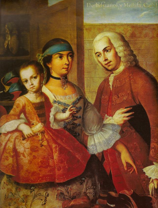
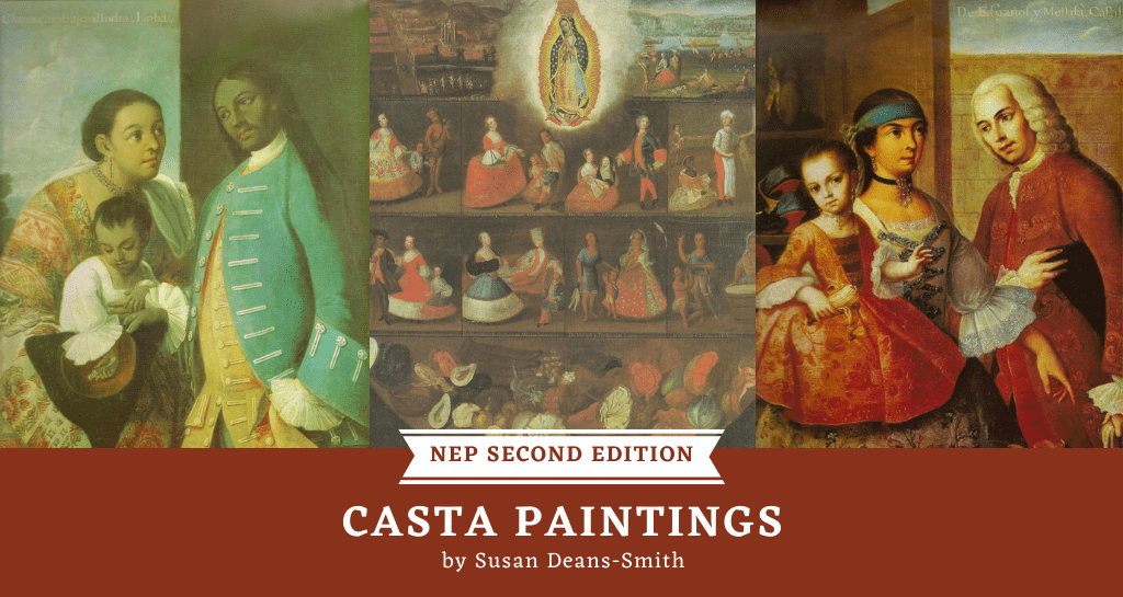
The casta series represent different racial mixtures that derived from the offspring of unions between Spaniards and Indians–mestizos, Spaniards and Blacks–mulattos, and Blacks and Indians–zambos. Subsequent intermixtures produced a mesmerizing racial taxonomy that included labels such as “no te entiendo,” (“I don’t understand who you are”), an offspring of so many racial mixtures that made ancestry difficult to determine, or “salta atrás” (“a jump backward”) which could denote African ancestry. The overwhelming majority of extant casta series were produced and painted in Mexico. While most of the artists remain anonymous, those who have been identified include some of the most prominent painters in eighteenth-century Mexico including Miguel Cabrera, Juan Rodríguez Juárez, José de Ibarra, José Joaquín Magón, and Francisco Vallejo.

Casta paintings were presented most commonly in a series of sixteen individual canvases or a single canvas divided into sixteen compartments. The series usually depict a man, woman, and child, arranged according to a hierarchies of race and status, the latter increasingly represented by occupation as well as dress by the mid-eighteenth century. The paintings are usually numbered and the racial mixtures identified in inscriptions.  Spanish men are often portrayed as men of leisure or professionals, blacks and mulattos as coachmen, Indians as food vendors, and mestizos as tailors, shoemakers, and tobacconists. Mulattas and mestizas are often represented as cooks, spinners, and seamstresses. Despite clear duplications, significant variations occur in casta sets produced throughout the eighteenth and early nineteenth centuries. Whereas some series restrict themselves to representation and specification of racial mixtures, dress styles, and material culture, others are more detailed in their representation of flora and fauna peculiar to the New World (avocadoes, prickly pear, parrots, armadillos, and different types of indigenous peoples). While the majority appear to be in urban settings, several series depict rural landscapes.
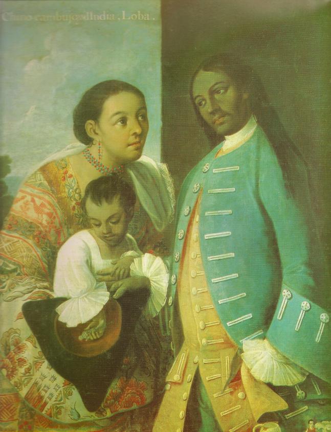
Casta_2_Cabrera

What do these exquisitely beguiling images tell us about colonial society and Spanish imperial rule? As with textual evidence, we cannot take them as unmediated and transparent sources. Spanish elites’ anxiety about the breakdown of a clear socio-racial hierarchy in colonial society–the sistema de castas or caste system–that privileged a white, Spanish elite partially accounts for the development of this genre. Countering those anxieties, casta paintings depict colonial social life and mixed-race people in idealized terms. Instead of the beggars, vagrants, and drunks that populated travelers’ accounts and Spanish bureaucratic reports about its colonial populations, viewers gaze upon scenes of prosperity and domesticity, of subjects engaged in productive labor, consumption, and commerce. Familiar tropes of the idle and drunken castas are only occasionally depicted in scenes of domestic conflict. In addition, European desires for exotica and the growing popularity of natural history contributed to the demand for casta paintings. The only extant casta series from Peru was commissioned as a gift specifically for the natural history collection of the Prince of Asturias (the future Charles IV of Spain). And despite Dr. Arce y Miranda’s fears, many contemporaries believed the casta series offered positive images of Mexico and America as well as of Spanish imperial rule. In this regard, the casta paintings tell us as much about Mexico’s and Spain’s aspirations and resources as they do about racial mixing.  Many owners of casta paintings were high-ranking colonial bureaucrats, military officials, and clergy, who took their casta paintings back to Spain with them when they completed their service in America. But there is also evidence of patrons from the middling ranks of the colonial bureaucracy. Very fragmentary data on the price of casta paintings suggests that their purchase would not have been restricted to only the very wealthy.

The casta paintings were displayed in official public spaces, such as museums, universities, high ranking officials’ residences and palaces, as well as in unofficial spaces when some private collections would be opened up to limited public viewing. The main public space where casta paintings could have been viewed by a wide audience was the Natural History Museum in Madrid.

Casta_1_Luis_de_Mena

Regardless of what patrons and artists may have intended casta paintings to convey, viewers responded to them according to their own points of reference and contexts. While much remains to be learned about who saw sets of casta paintings and where they saw them, fragmentary evidence suggests varied audience responses. The English traveler Richard Phillips, visiting the Natural History Museum in Madrid in 1803, enthusiastically encouraged his readers to go and see the casta paintings as exemplary exotica along with Japanese drums and Canopus pots from Egypt. Another English traveler, Richard Twiss, expressed skepticism about the inscriptions that described the racial mixtures depicted in a casta series he viewed in a private house in Malaga. And, to return to Arce y Miranda in Mexico, the casta paintings for him signified a slur on the reputation of creoles in Mexico.

Although we have a good general understanding of the development of this provocative genre much remains to be understood about the circulation, patronage, and reception of the casta paintings. We know, for example, that some casta series found their way to England. One tantalizing piece of evidence comes from the British landscape painter Thomas Jones (1742-1803) who made a diary entry in 1774 about a set of casta paintings he viewed at a friend’s house in Chesham. How these paintings were acquired by their English owners, as purchases, gifts, or through more nefarious means, remains an open question. We also need to know much more about patrons of the casta paintings and the painters in order to deepen our understanding about innovations and new interpretations that appear in this genre.

This is an electronic version of an article published in the Colonial Latin American Review © 2005 Copyright Taylor & Francis; Colonial Latin American Review is available online at www.tandfonline.com http://www.tandfonline.com/doi/abs/10.1080/10609160500314980

For more on casta paintings:

Magali M. Carrera, Imagining identity in New Spain: Race, Lineage, and the Colonial Body in Portraiture and Casta Paintings (2003)

María Concepción García Saiz, Las castas mexicanas: un género pictórico americano (1989)

Ilona Katzew, Casta Painting: Images of Race in Eighteenth-Century Mexico (2004)

You may also like: Naming and Picturing New World Nature, by Maria Jose Afanador LLach (here on NEP)

Credits:
1. De Español y Mestizo, Castizo de Miguel Cabrera. Nº. Inv. 00006
2. De Chino Cambujo y India, Loba de Miguel Cabrera. NÂş. Inv. 00011
3. Castas de Luis de Mena. NÂŞ.Inv. 00026
Posted by permission of El Museo de América, Madrid

Naming and Picturing New World Nature

by Maria Jose Afanador

When Cassiano dal Pozzo, the Pope’s personal assistant, returned to the Vatican from Spain in 1626, he brought with him a Mexican manuscript on natural history, the Libellus de medicinalibus Indorum herbis.  The “herbal” was a marvelous Mexican manuscript containing illustrations of more than 180 plants.  Commonly known as Codice de la Cruz-Badiano, it is considered the first illustrated survey of Mexican nature produced in the New World.

In 1552, the son of the Viceroy, Francisco de Mendoza, sent the Latin manuscript to Spain, where it probably remained until the early seventeeth century, when it came into the possession of Diego de Cortavila y Sanabria. It next appeared in the library of the Italian Cardinal Francesco Barberini, where it remained until 1902, when the Barberini library became part of the Vatican Library. The manuscript was rediscovered in 1929 by Charles Upson Clark and finally, in 1991, Pope John Paul II returned the Libellus to Mexico, where it is now in the library of the National Institute of Anthropology and History in Mexico City.

Fig_3The herbal is organized in chapters associated with parts of the body, starting with afflictions of the head, eyes, ears, nose, teeth, and cheeks; it then goes to the chest and stomach, and continues with the knees and feet; it ends with “falling sickness or comitial sickness” and remedies for “fear or faint-heartedness, mental stupor, for one afflicted by a whirlwind or a bad wind, … and for a traveler crossing a river or lake.” The diseases treated in the herbals are named in Latin in accordance with the tradition of medieval and early modern European herbals. However, the names of the plants are all written in Náhuatl, the indigenous Aztec language.

The manuscript, produced by a Nahua physician, Martín de la Cruz, and translated into Latin by Juan Badiano, was a gift for the king that sought to demonstrate the worthiness of educating the Nahua nobility in the Colegio de Santa Cruz de Tlatelolco. At first glance, this marvelous codex resembles a typical medieval herbal. A closer look, however, reveals a fascinating blend of European and Aztec cultures. The codice can be viewed as a form of expression of the Nahua in a context of increased European influence and as a manner of dealing with a changing reality.

Fig_1 Visual culture is a powerful means by which different societies depict reality and convey meanings. The images contained in this sixteenth-century manuscript pose great challenges to scholars willing to consider visual evidence as core material of historical analysis. What was the purpose of the pictographic material as utilized by the authors of the codice? Can we determine which patterns and conventions are purely Aztec or European? Is there such thing as a pure visual tradition? Does it make sense to study colonial sources under the assumption of cultural contamination? Aside from questions of cultural purity or contamination, perhaps a more interesting question to be asked is whether the purpose of these illustrations is primarily informational or aesthetic.

As a gift to the king, aesthetics certainly played an important role in the purpose of the illustrations. The beauty of the pictures is undeniable, and the extensive use of colors to depict nature surpasses other depictions of nature of the time. Although scholars have regarded the manuscript as a European source due to its resemblance to late medieval and early modern herbals, the codice contains pictographic elements of the Nahua tradition such as the glyphs, which convey both descriptive elements and  the ecology of the plants. Take for example the Nahua glyph for stone –tetl– which works as a ideogram to point to the rocky soil in which the plant grows in the illustration above. The ants visible among the roots in the illustration below also indicate the environment in which this plant grows. The ants, however, are not associated with any Náhuatl glyph but it was common in European herbals to include associated parasites in such illustrations.

image
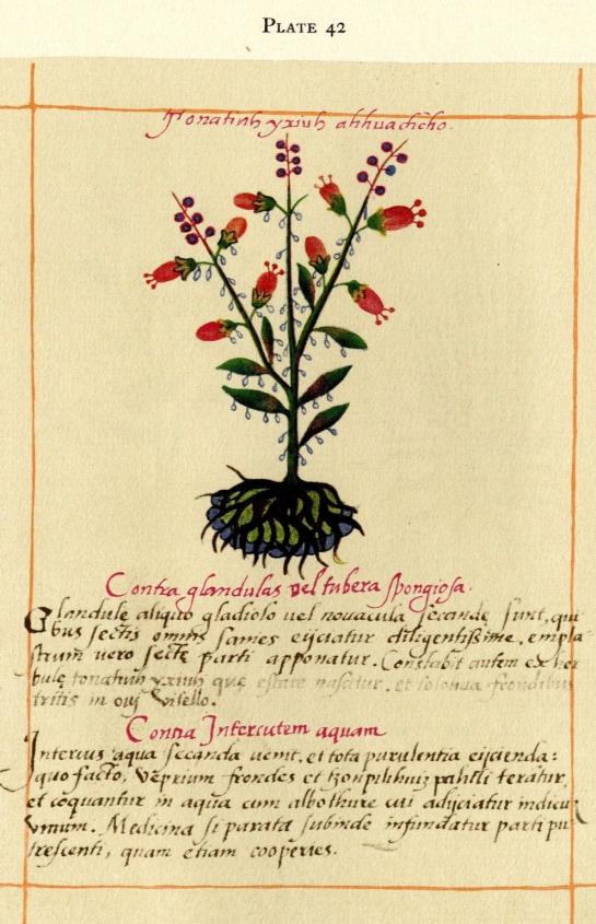
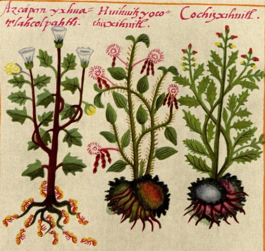
The Codice de la Cruz-Badiano is an example of the encounter of between writing systems, and thus of systems of knowledge, with multiple swings from the pictographic-glyphic tradition to the alphabetical. The illustrations are by no means subordinated to the writing. Visual evidence and linguistic analysis of Náhuatl offer ways of approaching the complexities of cultural forms and to provide information about natural history that was not present in the Latin texts.

This article is excerpted from the forthcoming publication:

Maria José Afanador Llach. “Nombrar y representar. Escritura y naturaleza en el Códice De la Cruz-Badiano, 1552.” In Fronteras de la Historia, vol. 16-1, Instituto Colombiano de Antropología e Historia, Bogotá, June 2011. 

The codice is available in facsimile: De la Cruz, Martín, The Badianus manuscript (Codex Barberini, Latin 241) Vatican Library; an Aztec herbal of 1552. Ed. Emily Walcott Emmart. Baltimore: The Johns Hopkins Press, 1940.

For more on the codice see:

Debra Hassig, “Transplanted Medicine: Colonial Mexican Herbals of the Sixteenth Century.” Anthropology and Aesthetics 17-18, Spring/‌Autumn (1989).

Recent Posts

  • IHS Workshop: “Whose Decolonization? The Collection of Andean Ancestors and the Silences of American History” by Christopher Heaney, Pennsylvania State University
  • Converting “Latinos” during Salem’s Witch Trials: A Review of Cotton Mather’s Spanish Lessons: A Story of Language, Race, and Belonging in the Early Americas (2022) by Kirsten Silva Gruesz
  • Breaking ChatGPT: Good Teaching Still Beats the Best AI
  • Remembering Rio Speedway
  • Fear Not the Bot: ChatGPT as Just One More Screwdriver in the Tool Kit
NOT EVEN PAST is produced by

The Department of History

The University of Texas at Austin

We are supported by the College of Liberal Arts
And our Readers

Donate
Contact

All content © 2010-present NOT EVEN PAST and the authors, unless otherwise noted

Sign up to receive our MONTHLY NEWSLETTER

  • Features
  • Books
  • Teaching
  • Digital & Film
  • Blog
  • IHS
  • Texas
  • Spotlight
  • About